Modern UX is SharePoint's future
When I talk to clients and colleagues about SharePoint, the topic often turns to what's new and exciting, and many people are surprised to learn that SharePoint Server 2019 isn't really the latest and greatest version of SharePoint. The latest version of SharePoint is called "Modern SharePoint," or the Modern user experience (UX), and it's been running in SharePoint Online in one form or another since 2016.
Saying the Modern UX is the newest version requires some explanation, since Microsoft first introduced and rolled it out two years ago and SharePoint 2019 was just released a little over a month ago. When Modern was first rolled out, though, it was seen only in document libraries. Over the following two years, Microsoft deployed the Modern UX to lists, pages, the SharePoint.aspx landing page, Office 365 Group-connected Team sites, and finally Communication sites, the successor to SharePoint's venerable Publishing sites.
While a version of the Modern UX is featured in SharePoint 2019, the most current and up to date version will always be found in SharePoint Online, since Microsoft is constantly deploying updates, improvements, and new capabilities to it.
So… what exactly is it?
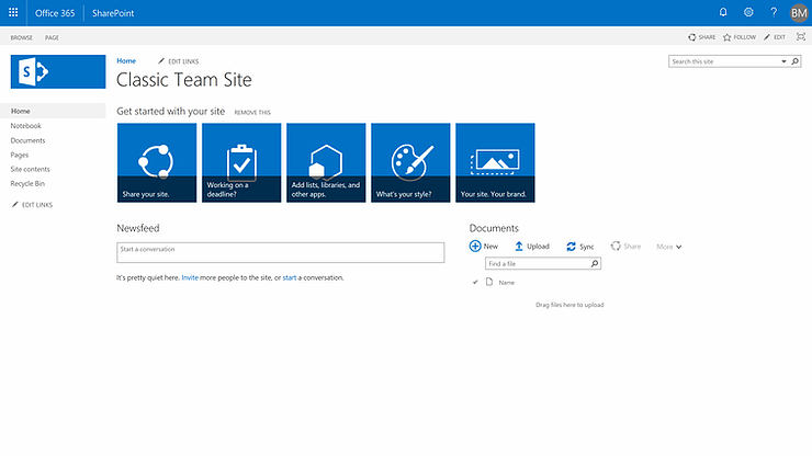
So, what is the Modern UX, and how is it different from "Classic" SharePoint? Perhaps first it would be helpful to show what Modern isn't…

This is a Team site featuring the Classic user interface, first deployed back in 2012 with SharePoint Server 2013, then only minimally updated for SharePoint Server 2016 and SharePoint Online.
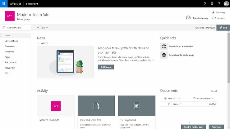
A Team site with the Modern user interface looks quite different:

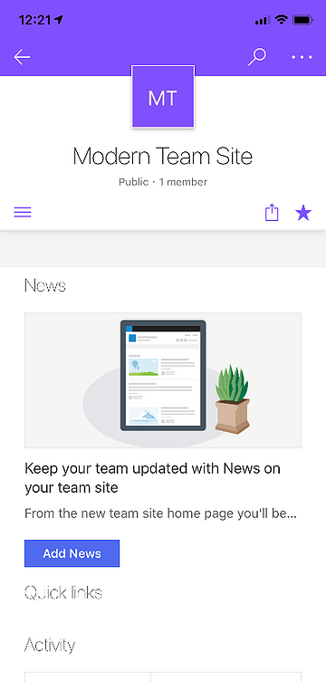
The Modern UX has been designed from the ground up to be more intuitive, powerful, and convenient for today's end users, and whether they connect to SharePoint on a traditional PC or a handheld mobile device, the content will be the same.

More than just a new look and feel with a user-friendly focus, Modern is a reimagining of SharePoint. Whereas previous versions of SharePoint are more of a platform where power users and developers create sites for their users, Modern SharePoint is more of an app than a sandbox. While two different companies can customize their content and theming to suit their needs, both companies' SharePoint sites will be recognizably SharePoint, and importantly the SharePoint mobile app will work perfectly with both. Previous attempts at bringing mobile form factors to SharePoint had to compromise a lot since there was no guarantee that two different SharePoint deployments would look or behave anything like each other. But now that Microsoft has taken more control over how SharePoint looks and is delivered, they are able to support a SharePoint app that will work universally—as long as the SharePoint site is running the Modern UX.
Iterative development process
And that's another major difference with Modern. Not only do you have a choice when building a new site as to whether or not it will be Classic or Modern, but in many cases, you may have to build sites that have elements of both. It's not an ideal situation, but Classic still has many features that Modern doesn't, yet. The situation has vastly improved from the days when Modern showed up whenever you clicked a document library, but the rest of your site was Classic. Modern is the first version of SharePoint that has been developed in this iterative, piecemeal approach. Microsoft is working hard to completely replace all Classic capabilities with Modern equivalents, but it's an ongoing process and they're not quite there yet.
Building Modern sites
Building new Modern sites can be done from the SharePoint.aspx landing page, from the SharePoint admin center, and with PowerShell. There is unfortunately no way currently to convert an existing Classic site to a Modern one. Instead, to fully take advantage of the Modern UX, new sites will need to be built and the content from old, Classic sites will then need to be moved over with a migration tool. Microsoft does offer a free migration tool now, so for simple jobs you may not need to purchase a third-party tool (though most modern tools do come with a number of powerful features and additional capabilities that may be worth considering, anyway).
Once you've built a new Modern site, you can apply your company's brand or join it to a hub site. Branding a Modern site is much easier than before… mostly because there aren't nearly as many options, in keeping with the philosophy of delivering SharePoint as more of an app and less of a development platform. Joining the new site to a hub site lets it inherit the hub site's navigation, branding, and some deployment rules (if you've configured them). In effect, the hub site becomes the new site's parent site.
Filling out your new site with lists, libraries, pages, and content has never been easier, and the process of editing web pages is actually, dare I say, fun. I've never been able to say that about editing SharePoint pages before, and I've been doing SharePoint for a long time.
Building solutions with Modern tools
Developing new capabilities for SharePoint is also different in Modern. Developing solutions in previous versions of SharePoint required learning SharePoint-specific technologies, but Modern has been developed to be compatible with the tools that are already familiar and comfortable to web developers. Web developers proficient in Angular, React, and other popular JavaScript frameworks can bring those skills directly to bear in SharePoint today, alongside other tools like npm, Gulp, Yeoman, and many more.
But for those of us who don't code day in and day out, SharePoint has always been about empowering power users to develop no-code and low-code solutions for their users, and Modern is no different. Instead of using the increasingly long-in-the-tooth SharePoint Designer for workflows and InfoPath for forms, Modern integrates very nicely with Microsoft Flow and PowerApps, both apps that Microsoft is also continually developing and improving.
On the downside, some of the powerful tools that power users have used in the past to great effect haven't yet been completely replaced in Modern. Specifically, there is no good replacement for the wonderful Content Query and Content Search web parts in Modern, and those of us who have relied on the Script Editor web part won't find anything similar in the much smaller web part gallery for Modern pages. There are third-party and community-built replacements available on the Web, particularly from the Patterns and Practices group on GitHub, but they are of varying quality and often aren't supported, so the net result is that some features that power users have enjoyed simply aren't available in Modern yet.
Upgrading your intranet to Modern UX
If you want to upgrade your intranet to Modern, well… you can't. As mentioned, there's no way to "upgrade" an existing Classic site to Modern, so you'll have to "migrate" it instead by building new Modern sites and using a tool to migrate content from the old sites to the new. This can be a time-consuming and complex process, depending on how much content you have. So why do it? The Classic UX is still supported, right?
Yes, Classic isn't going anywhere. Microsoft knows that many customers depend on Classic's greater customization capabilities, so they're not going to pull the rug out from under so many sites. Classic is supported and will be for some time. However, Microsoft's also not devoting any resources to improving Classic. It has been given, in effect, an expiration notice, if not a date, and it will eventually be deprecated, even if it's several years in the future. Meanwhile, Microsoft's making great strides with Modern and deploying and working on great new features all the time—have you heard about SharePoint Spaces, for example, which will give you the ability to turn a site's content into a virtual reality showroom?—and more and more when people talk about SharePoint, they're not going to be talking about Classic. Furthermore, it's going to become more and more expensive to develop Classic sites as the skills needed to do so become rarer.
So all that said, if you're building a new site, you will need a really good reason to build it in Classic instead of Modern, and for your existing sites, it would be wise to start thinking about how you might start the process of converting them.
Wrapping up
SharePoint's Modern UX has made great strides since it was introduced two years ago, and it's now a fully-fledged, enterprise-ready solution for building intranets, document repositories, and other traditional SharePoint solutions. Converting a Classic site to Modern may require thought and effort, but the end result will be a truly contemporary, up-to-date site that your end users will enjoy and can use easily and with full fidelity on all their devices. These are exciting days for SharePoint!


Comments