A better mobile experience with Modern SharePoint
"Classic" SharePoint has, technically, supported mobile form factors for several versions, but never very well. Most sites in the classic UI come with mobile views, but critically absent has been the ability to seamlessly view SharePoint pages, Microsoft focusing instead on providing mobile access to lists and libraries and their contents.
It's an understandable focus point, as most of SharePoint's activity happens in lists and libraries, but failing to provide a good page viewing experience means that the mobile apps and views lacked that critical glue that so often binds a SharePoint site together. Furthermore, and even worse, the experience of viewing lists and libraries in the old mobile views was frankly subpar.
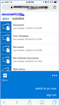
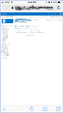
To address classic SharePoint's poor mobile experience, companies would have to task developers or consultants to build a completely custom master page solution for their SharePoint sites, usually employing responsive web design methodologies. But this approach really only made viewing pages better. Lists and libraries very rarely looked good, even with a custom master page, often forcing the user to scroll horizontally to see all of a list's data, and offering incredibly tiny links for large fingers to tap.
(Left) Classic SharePoint in a Mobile View on the iPhone
(Right) Classic SharePoint in PC view on iPhone
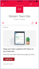
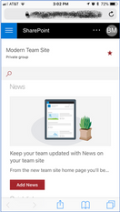
"Modern" SharePoint, on the other hand, has been built from day one with mobile usage in mind. Whether a user comes to a SharePoint page from a browser on their PC, a browser on their tablet, or using the dedicated SharePoint app that's available on all popular smartphone platforms, the experience should be consistent, efficient, and fun, and with modern SharePoint, Microsoft has finally succeeded. The new and improved page editor (which we will look at in more detail in a later post) natively builds responsive pages that look consistent across all browser form factors.
(Left) Modern Site in SharePoint App
(Center) Modern Site in Safari Browser (iPhone)
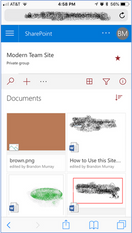
(Right) Document Library in Modern SharePoint
I like the browser experience slightly better than the mobile app’s, since the app sometimes crashes, and it forces you to open documents in a separate OneDrive app. So I tend to use my iPhone’s browser for most tasks. However, I think the page creation and editing experience on the app is better than the browser experience, so which you prefer may come down to what you do in SharePoint most often. Either way, both experiences are designed for mobile, and allow you to enjoy a more fully SharePoint experience on your phone than has ever been the case before.
If your workforce is on the go and depends on smartphones and tablets to get the resources needed to do their jobs, modern SharePoint should absolutely be a part of your intranet strategy. But even if your workforce works primarily from stationary desks, providing a great mobile experience in this day and age is not a "nice-to-have," it is essential. And in this regard, classic SharePoint falls way behind modern SharePoint.


Comments